Break Point
The layout is adjusted within the designated breakpoint range according to the screen size and orientation.
Please refer to the breakpoints by case that are used in Click to Buy.
Break Point
-
Resolution
Mobile : Default 375px - 1023px
Tablet : 1024px - 1239px
Web(PC) : 1240px or above, Default breakpoint 1920px -
Size Unit
Tablets or devices larger than tablets: %, em
Mobile devices smaller than tablets: px, em

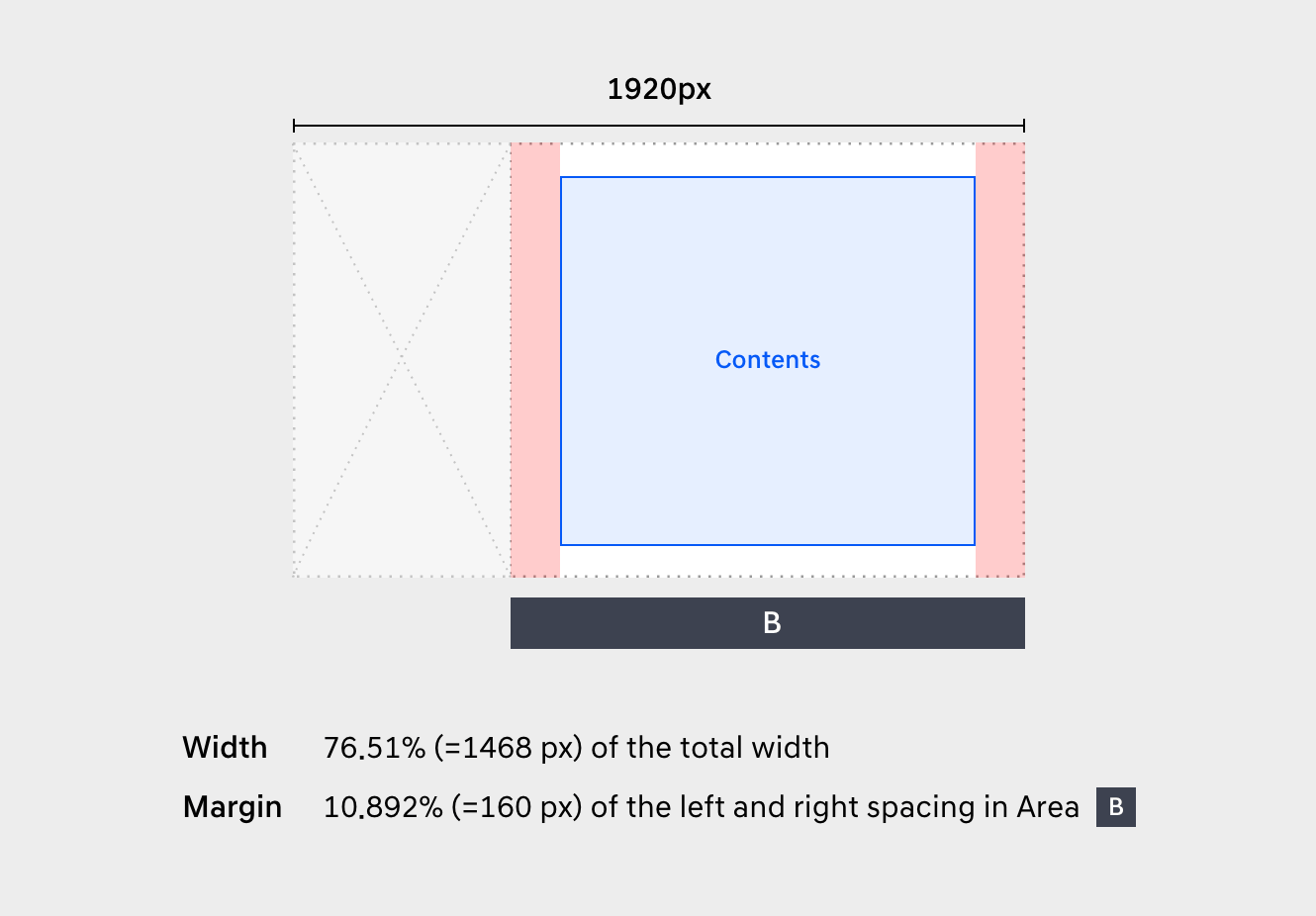
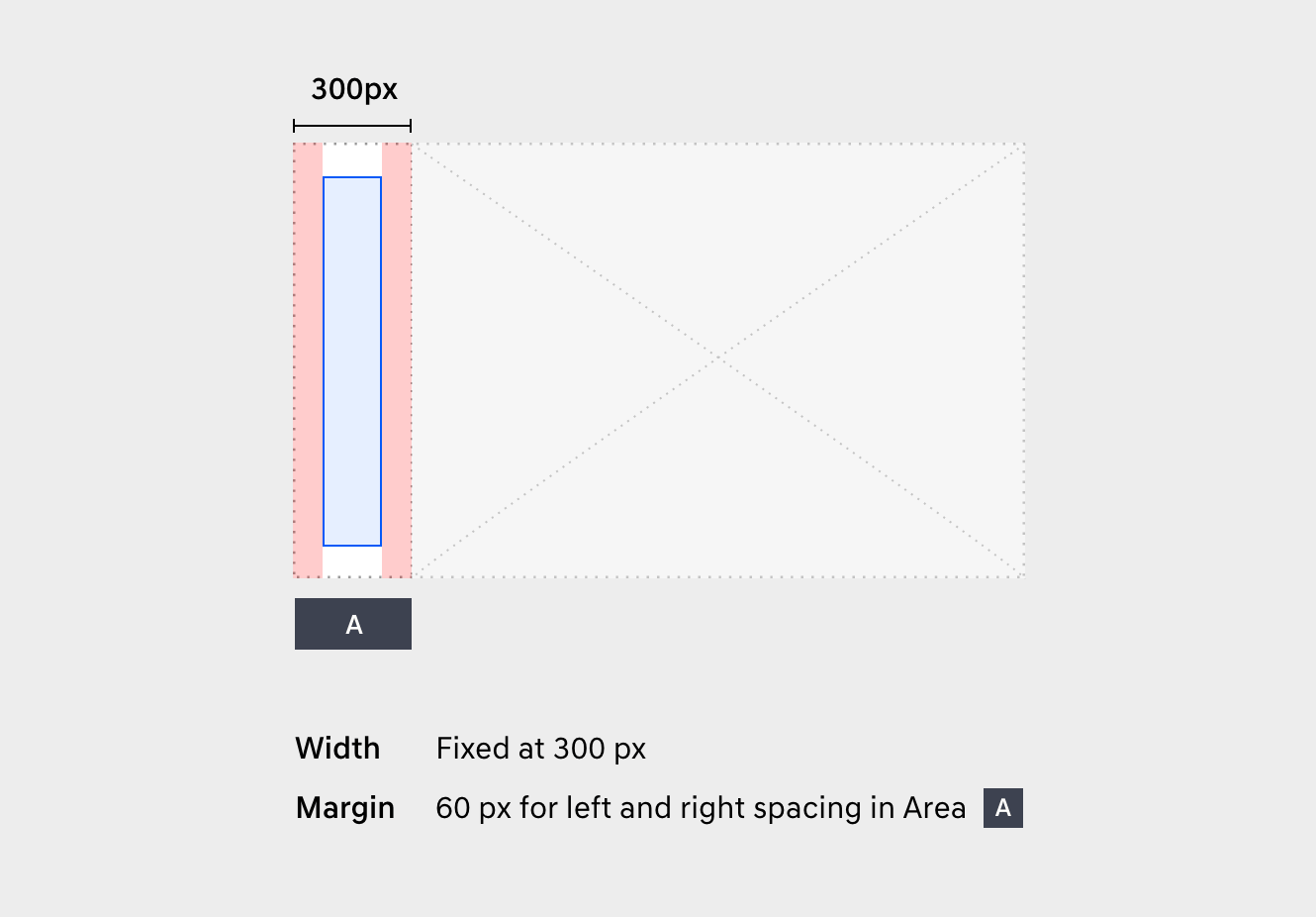
Left Menu Type
Case 1
The screen using the left menu is based on the breakpoint case 1.
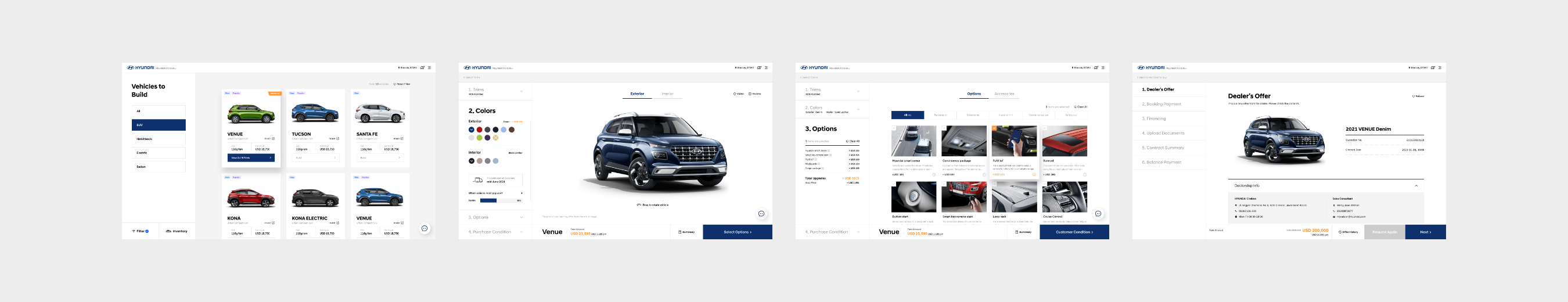
ANavigation Area (Left)
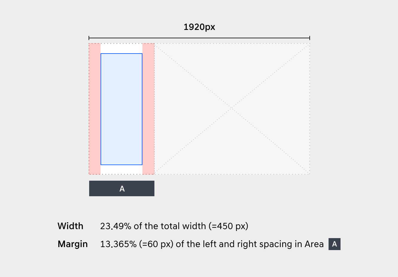
BContents Area (Right)
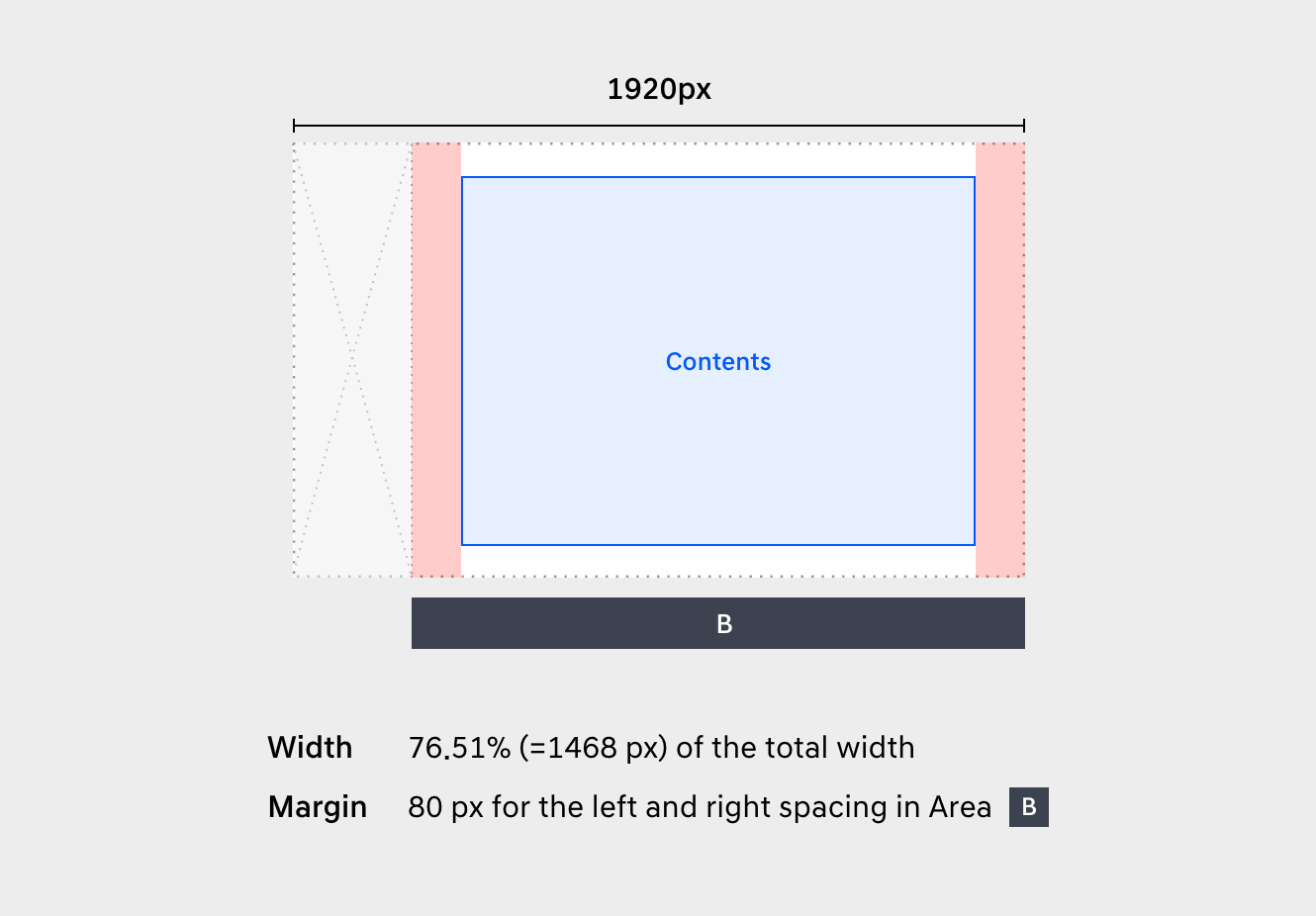
Case 2
The personalized screen is based on the breakpoint case 2.

AMenu (Left)
BContents Area (Right)
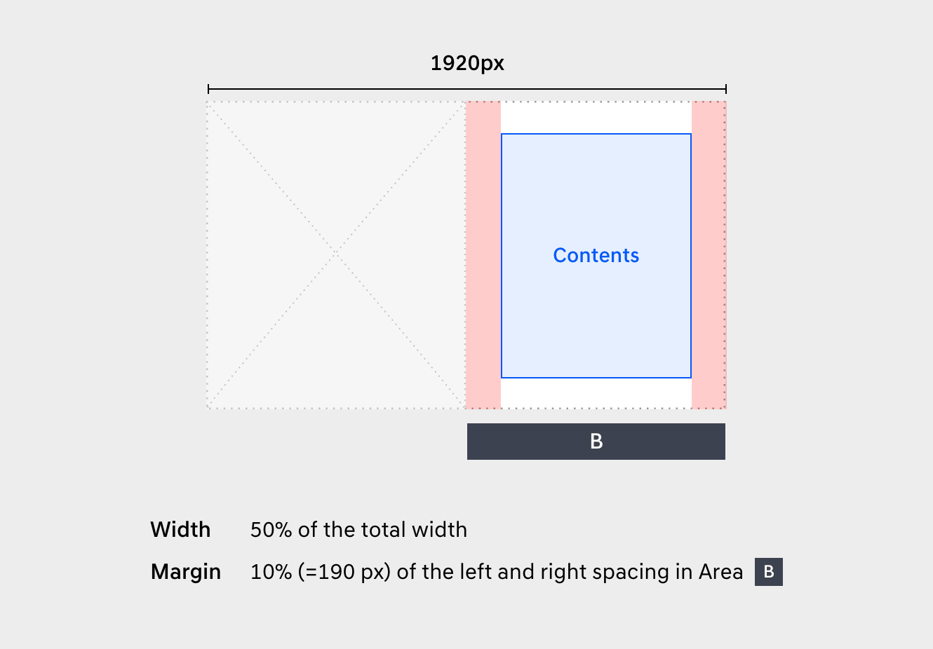
Half Type
The screen using 1:1 ratio is based on the half type breakpoint.

AVisual Area (Left)
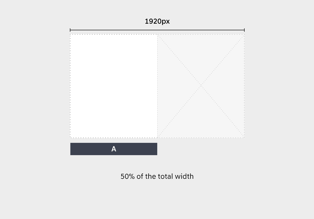
BText Area (Right)
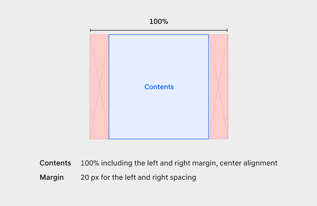
Center Type
A type that the content is fixed at 1200px.

A1280 or higher
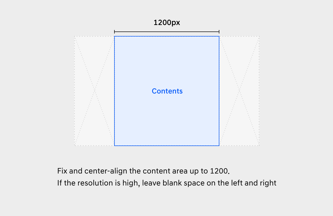
BLower than 1280
Policy
1. Purpose for Collection and Use of the Personal Information
The Company collects and uses personal information of users for the purposes described below. The collected personal information will be used only for the purposes below, and when the Company wishes to change the purposes, it will take necessary measures to comply with relevant regulations.
① The membership enrollment of the Guide System website and its management.
Confirming the intention to sign up as a member of the Guide System website (hereinafter, “Member”), confirming identification for the provision of membership service, maintaining and managing of membership, compiling the statistics for the use of service, limiting the use of the Members who violate the Guide System Website Term of Use, preventing illegal or unauthorized use of service, delivering notifications, handling complaints, preserving records for dispute resolution, providing benefits and guidance, confirming the intention to withdraw from membership
② The management of Members’ contents download history
2. Legal Basis for the Processing of Personal Information
-
a) In case of Hyundai Motor Company employee
The Company collects and processes Member’s personal information based on the employment contract between Member and the Company, as this website allows you to more effectively perform your work regarding Hyundai Global Online Sales
-
b) In case of non-Hyundai Motor Company employee
In case of essentially collected personal information, the Company collects and processes Member’s personal information to enter into or perform a) Hyundai Global Online Sales between Member’s company and the Company and b) employment contract between Member and Member’s company, as this website allows easier communication and work cooperation in regards to Hyundai Global Online Sales between Member’s company and the Company
In case of optionally collected personal information, the Company collects and processes Member’s personal information based on Member’s consent
3. Personal Information to be Collected and Methods of Collection
① The Company collects the following personal information.
-
a) In case of Hyundai Motor Company employee
Name, name of department or team, e-mail address, ID, password
b) In case of non-Hyundai Motor Company employee
Name, name of company, e-mail address, name of person in charge of Hyundai Motor Company regional office, e-mail address of person in charge of Hyundai Motor Company regional office
The following information may be automatically generated and collected in the course of using the service
- Service use records, access logs, access IP information, etc.
② The Company collects personal information with the following methods.
- Membership application procedure from the guide system
4. Retention of Personal Information and Period of Use
① The company retains and uses the user's personal information based on the following standards.
- Email address: Until 14 days after membership expiration
- Name: 2 years after membership expiration
- Company name: 2 years after membership expiration
- Department name: 2 years after membership expiration
② The membership will expire 90 days after the initial sign up unless the member request extension of membership period
5. Destruction of Personal Information
① Unless the Company is obligated to preserve personal information under relevant regulations, the Company destroys personal information when it becomes unnecessary, without undue delay (i.e. when the retention period is terminated, when the purpose of collection and use is achieved etc.)
② The procedure and methods of destruction are as follows.
- A. Procedure of destruction
- The Company selects personal information to be destroyed and destroys it under the approval of the Company’s Personal Information manager.
- B. Methods of destruction
- - Personal information recorded or stored in electronic format will be destroyed in non-restorable manner.
- - Personal information recorded or stored in printed (paper) format will be shredded or incinerated.
6. Consignment of personal information processing
① The Company assigns the processing of personal information to an external specialized company.
- Assignee: Pungtai Korea
- The scope of Assigned work: [Recording, storing, and destroying of personal information]
② When the Company enters into the consignment contract with the Assignee, the following contents will be specified: prohibition of processing personal information outside the assigned purpose, technical and managerial protection measures, limitation of re-consignment, management and supervision on the assignee, remedies etc. The Company oversees whether the assignee collects and uses personal information in safe and appropriate manner.
③ When the scope of assigned work or the assignee is changed, the Company will reflect such change to this Privacy Policy and make it public on the guide system website.
7. Safeguarding measures of Personal Information
The Company takes measures to safeguard personal information as follows.
① Technical measures
- A. Encryption of user information
- Personal information of users is stored in the DB in encrypted from, so that personal information cannot be used in case of accidental leakage.
- B. Encryption of communications section
- For the section where the users’ personal information is entered and delivered in the process of signing up for membership and log-in, personal information is securely delivered through SSL.
- C. Installation of security solution
- For providing the service and safeguarding personal information, the Company has the following security measures in personal information processing system: vaccine program, periodical updates and program checks. For fighting intrusions such as hacking, continuous monitoring is performed by installing the intrusion prevention and detection system.
② Managerial measures
- A. Establishment of personal information management system
- For safeguarding personal information, an internal management system for personal information is established.
- B. Operation of personal information protection committee
- The Company organizes a committee for personal information protection and holds one or more meetings a year to improve and correct issues relating to the operation of the personal information management system and the protection of personal information.
- C. Management of personal information processors
- For personal information processors who handle user information, the Company conducts at least 1 personal information protection training session a year, to emphasize the importance of information processing and to ensure that personal information is handled securely. Further, the Company controls access rights of personal information processors to minimize unnecessary access to and disclosure of personal information.
8. Rights of Users and the Exercise thereof
① Users may exercise the following rights to the Company, with regards to the protection of their personal information.
- A. Right of access
- B. Right to rectification
- C. Right to erasure
- D. Right to restriction of processing
- E. Right to portability
- F. Right to object
- G. Right to withdraw consent
- H. Right to lodge a complaint
② Users may contact our Personal Information Manager at any time to exercise the aforementioned rights, in paper or electronic format such as email, fax etc. In this case, the Company will take necessary measures without undue delay.
③ When users request the rectification or erasure of their personal information, such information will not be used or provided to third parties until the necessary measure is taken.
9. Personal Information Manager
① To protect personal information and to handle complaints with regards to personal information, the Company has appointed Personal Information Manager as below.
-
Personal Information Manager
- Name : Sung eun Kim
- Phone number : +82-2-3464-2999
- E-mail address : sungeun.kim3@hyundai.com
② Should users have any inquiries about the protection of their personal information, the handling of complaints, or the remedy for damages while using the services provided by the Company, users may contact our Personal Information Manager or the department for personal information management.
In this case, the Company will answer to the inquiries promptly and sincerely.
10. Change of the Privacy Policy
① This Privacy Policy will take effect from [31 May, 2021].
② Previous Privacy Policy can be found on the the Guide System website.
③ If there is any change (addition, deletion, or rectification) in this Privacy Policy, the Company will post the changed version on the guide system website 7 days before such change takes effect.
Acceptance of Privacy Policy and Confidentiality Pledge and Notification of Future Changes.
By using the Hyundai Global Online Sales Platform Guide System, you signify your agreement to the terms of the Hyundai Global Online Sales Platform Guide System (hereinafter, “the Guide System ”) Website Privacy Policy and Confidentiality Pledge and as set forth in this and/or the most current update of this document. Hyundai Motor Company(hereinafter, “HMC”) reserves the right to change the Privacy Policy and Confidentiality Pledge at any time.
We will post those changes to this page so that you are aware of what information we collect, how we use it, and under what circumstances we disclose it. HMC will use, share, and disclose all personal and other user information in accordance with the Privacy Policy in effect at the time the information is collected.
If you do not agree to any parts of this policy, please do not use the Guide System website.
Continued use of this site following changes to these terms will mean that you accept these changes.
To prevent external leakage of the contents in the Hyundai Global Online Sales Platform Guide System, please read the following information carefully.
1. The registered Global Online Sales Platform Guides are valuable assets of Hyundai Motor Company and posted for efficient business support, should not be leaked to competitors or other external sources.
2. Legal action can be taken in the event of any misuse or external leakage.
3. The relevant information is recorded and monitored in the system every time the guide contents are stored.
4. For access rights and other inquiries in using this system, please contact.
- Sung Eun Kim, Customer Channel Strategy Team, sungeun.kim3@hyundai.com